


Research Question:
How do sleep values differ when comparing popular wearable devices of the Apple Watch, Amazon Halo, Oura Ring, and Whoop?
Summary
After completing my previous research comparing heart rate values of wearable devices during a ten-minute walk test, I wanted to step it up by comparing more devices for a longer duration. In addition to the reasoning previously stated, I also wanted to compare a different metric besides heart rate. With the increase in public awareness regarding sleep's importance, it was a no-brainer that it was my next topic of interest.
It is important to note the location of each device used in this study. The Apple Watch Series 8 was worn on my left wrist. The Whoop and Amazon Halo were both worn on my right wrist. The Oura ring was worn on my left index finger. Given that I had two devices on each extremity, it begs the question of whether there is a difference between the data produced depending on where the device is worn. However, I cannot answer that question specifically given that the Amazon Halo burned my wrist after about a month and a half of wearing it, and Amazon later shut down that part of the company. Despite the burn and inactive Halo, I decided to continue gathering data in order to produce what you see below.
This study took place over the course of 6 months where I wore all 4 devices on an almost 24-hour basis. The only time the devices were taken off my body was to charge them (aside from the Whoop which does not need to be removed in order to charge). I wanted to continuously wear these devices to increase their receptiveness to my daily patterns which ultimately lead to my sleep patterns. I thought that if I constantly wore the devices, they would be most accurate in distinguishing between my time spent awake and my time spent asleep.
Overall, I really enjoyed this study because it was longer than my previous study, it included more devices to compare, and it revolved around sleep which is something that I find extremely fascinating.
Comparison of Sleep Metrics
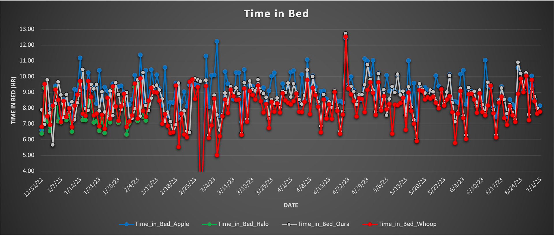
The chart to the right shows the comparison of the time in bed measured by each device. As you can see, the Amazon Halo stopped producing data after around 2 months because of the burn that it caused and ultimately the discontinuation of the product by Amazon.
Overall, I would say that all four devices are relatively close in the time they measured me to be in bed. The Apple Watch seems to say I spend more time in bed whereas the Whoop says I spend a little less time but, in general, they are relatively similar. There are some instances however where they are off by more than an hour which raises the question of the accuracy of this measurement between devices.
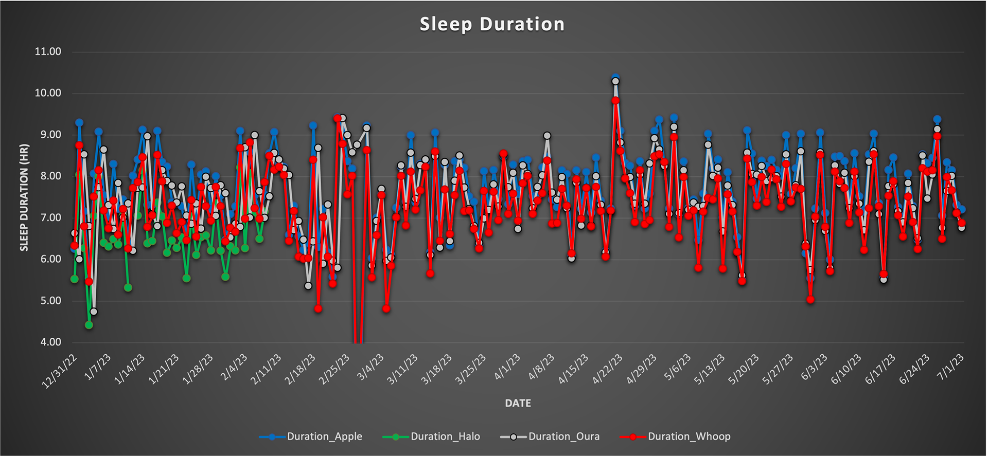
The chart to the left shows the comparison of my total sleep duration, or the time when I fell asleep to the time when I woke up. Similar to the graph above, it seems as though all four devices show a generally similar trend in sleep duration.
While they are all relatively similar, they are still not exact where, again, the Apple Watch tends to be on the higher end of the scale compared to the Whoop, and the Oura is right in the middle. Since I am not comparing these to a sleep plethysmography test, I can't say for certain which one is most accurate, but for a general comparison, each device's measurement is similar to that of the previous night.
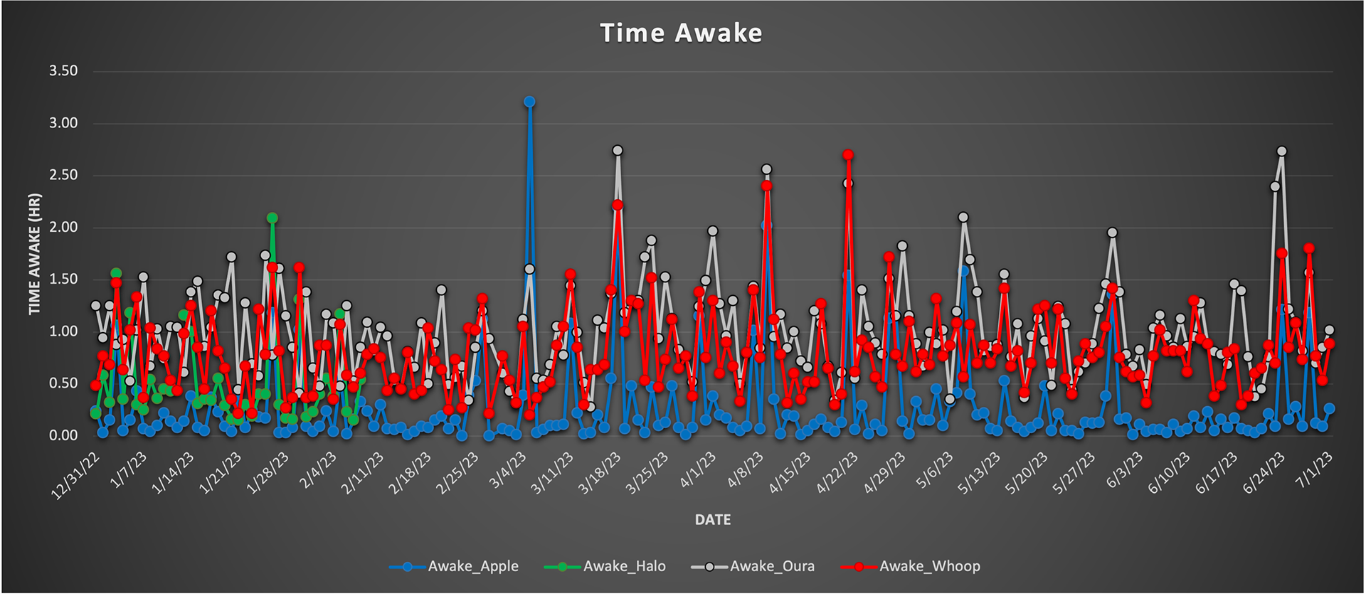
Unlike the previous two graphs, the data in the graph to the right demonstrates a very different trend. The last two graphs show the Apple Watch potentially overestimating the given metrics yet in the Time Awake category, it definitely seems to underestimate it, compared to the other devices.
Oftentimes, the Apple Watch says I spent less than 5 minutes awake whereas the other devices say I spent more time awake as indicated in the figure. Additionally, it seems as though the Oura ring is on the higher side of the scale and could potentially overestimate how much time I spent awake, at least compared to its more traditional midpoint between the Apple Watch and Whoop.
Since humans wake up multiple times throughout the night, many times without realizing it, this is one of the most interesting metrics to see and the fact that each device is quite different makes it all the more interesting.
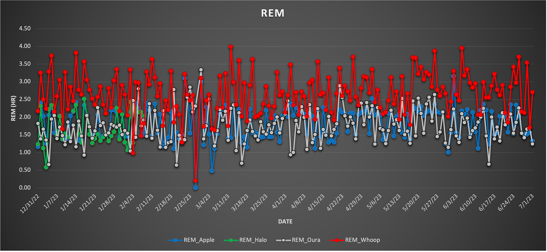
The graph to the left shows the estimated REM cycle measured by each of the devices. It is evident that the Whoop tends to measure a higher REM sleep time compared to the other devices. It seems as though the Oura ring and Apple Watch are more similar to one another in their measurements.
Again, this is not to say that one is more accurate than the other because I am not comparing it to a sleep plethysmography yet it is very intriguing to see the differences between the devices. The question arises, why does Whoop calculate a longer duration of REM sleep compared to the other devices measured? Is it an algorithm specific to their device or do other companies tend to use an algorithm more similar?
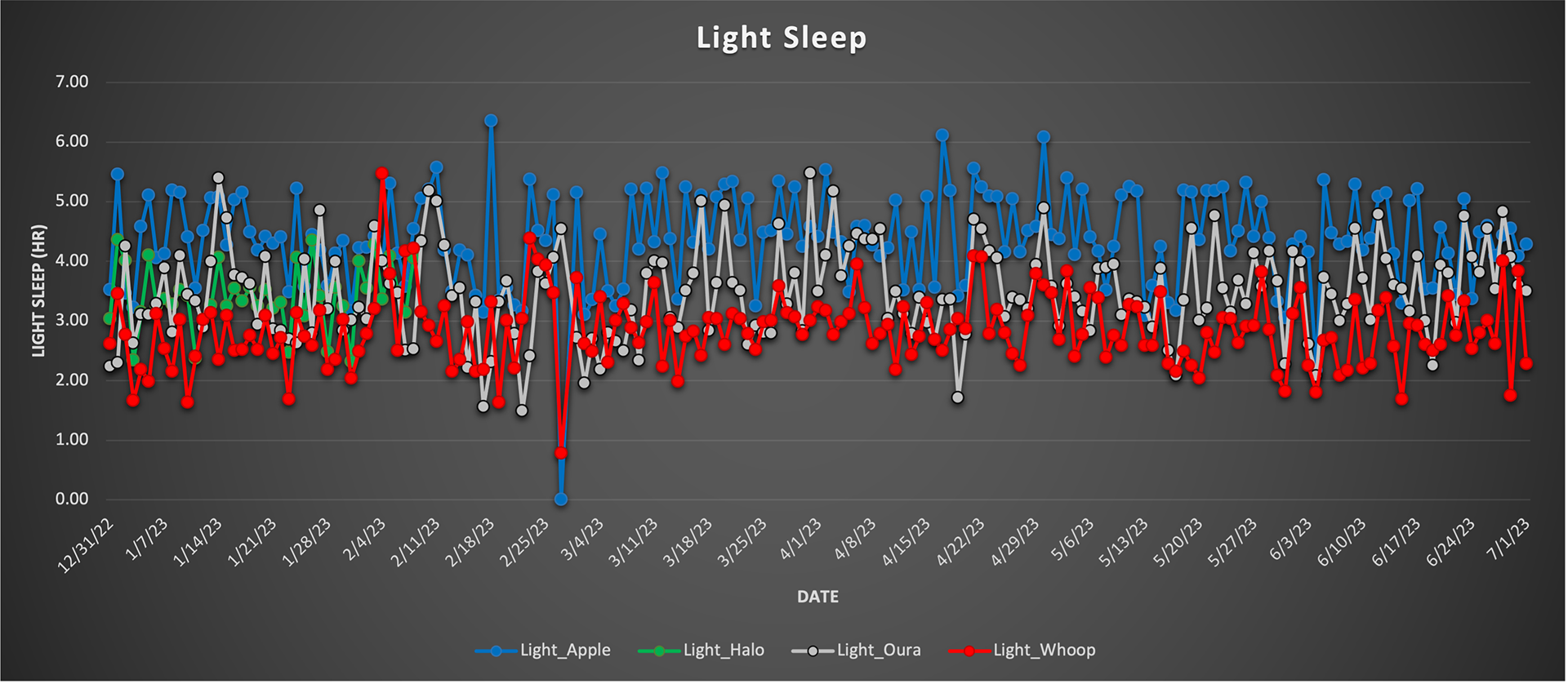
The graph to the right demonstrates the light sleep tracked by each device. As you can see, the trend follows in that the Apple Watch tends to think that I had longer light sleep compared to the other devices. The Whoop however believes that I had less light sleep compared to the other devices which is contradictory to the graph above where it quote-unquote overestimates REM sleep duration.
While there are major differences in some areas of the data, each device, compared to itself, shows a relatively similar trend. It appears that the Oura ring is almost constantly the median between both the Apple Watch and the Whoop, even here when it comes to light sleep.
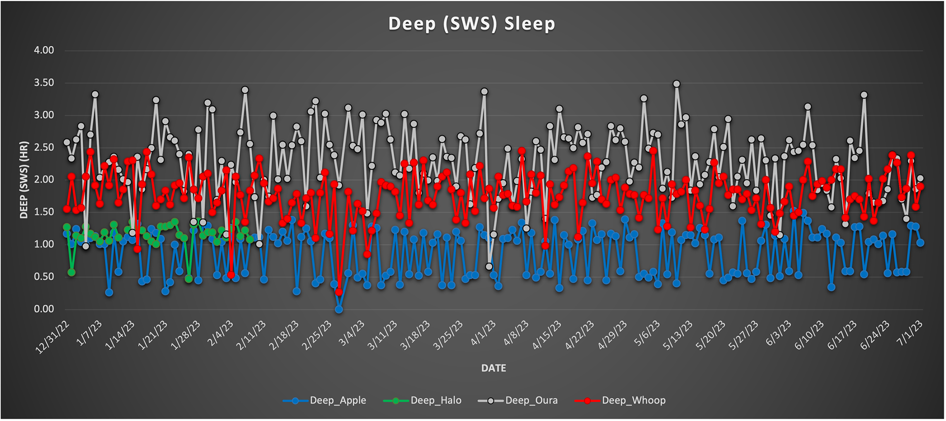
The graph to the left displays the duration of deep sleep, or slow wave sleep (SWS), measured by each device. The trend demonstrated in this figure is far different than the other graphs above in that the Oura ring measured a longer time compared to both the Apple Watch and Whoop. The figure is also drastically different from the graphs above because there is a wider range in the data between each device. Evidently, these devices don't agree at all (aside from the Apple Watch and Amazon Halo) when it comes to measuring deep sleep.
Given that this is the final sleep stage described in this write-up, it is interesting to see that the Oura ring measured highest compared to the other devices in all other categories where it was practically the average of both the Apple Watch and Whoop.
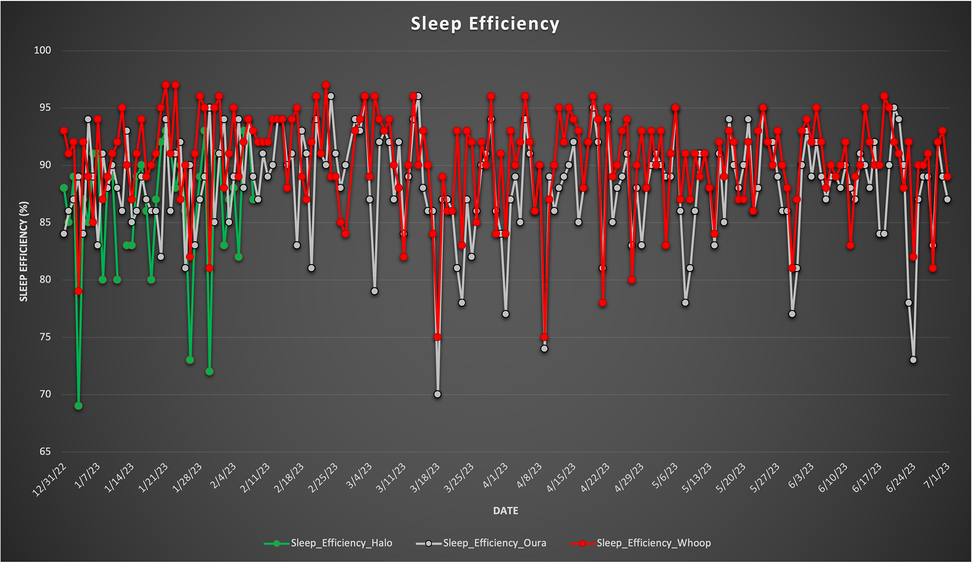
The graph to the right demonstrates the comparison of the efficiency of my sleep measured by a few of these companies. It appears that there are some instances where each device thinks that the efficiency of my sleep is relatively the same. Yet, there are some instances where there is a drastic difference between the given values demonstrating that measuring sleep efficiency is a difficult task. Also, not all of the devices measured track sleep efficiency, hence why they are not presented in the figure.
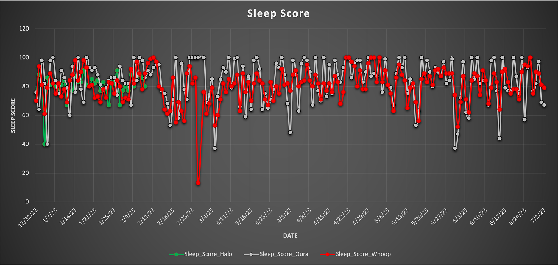
The graph to the left shows a score that some companies choose to give the sleep itself on a nightly basis. Honestly, this score is a little ambiguous but some people really like the fact that they are scored based on how well they've slept, and can quickly look at this score in the morning to begin their day.
This metric is not the greatest comparison considering the companies may use a different scale but I would say that, at least when comparing all three devices that track this measurement, they are relatively similar, as you can see in the figure.
Comparison of Health Metrics
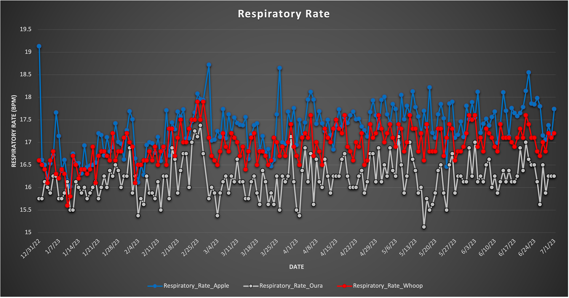
The figure to the right presents the respiratory rate comparison of three of the four devices. As per the typical trend when comparing these devices in most of these categories, the Apple Watch estimates my respiratory rate, or breaths per minute, to be higher compared to the Oura ring and Whoop. Clearly, there is a considerable range between all three devices when it comes to measuring respiratory rate while sleeping.
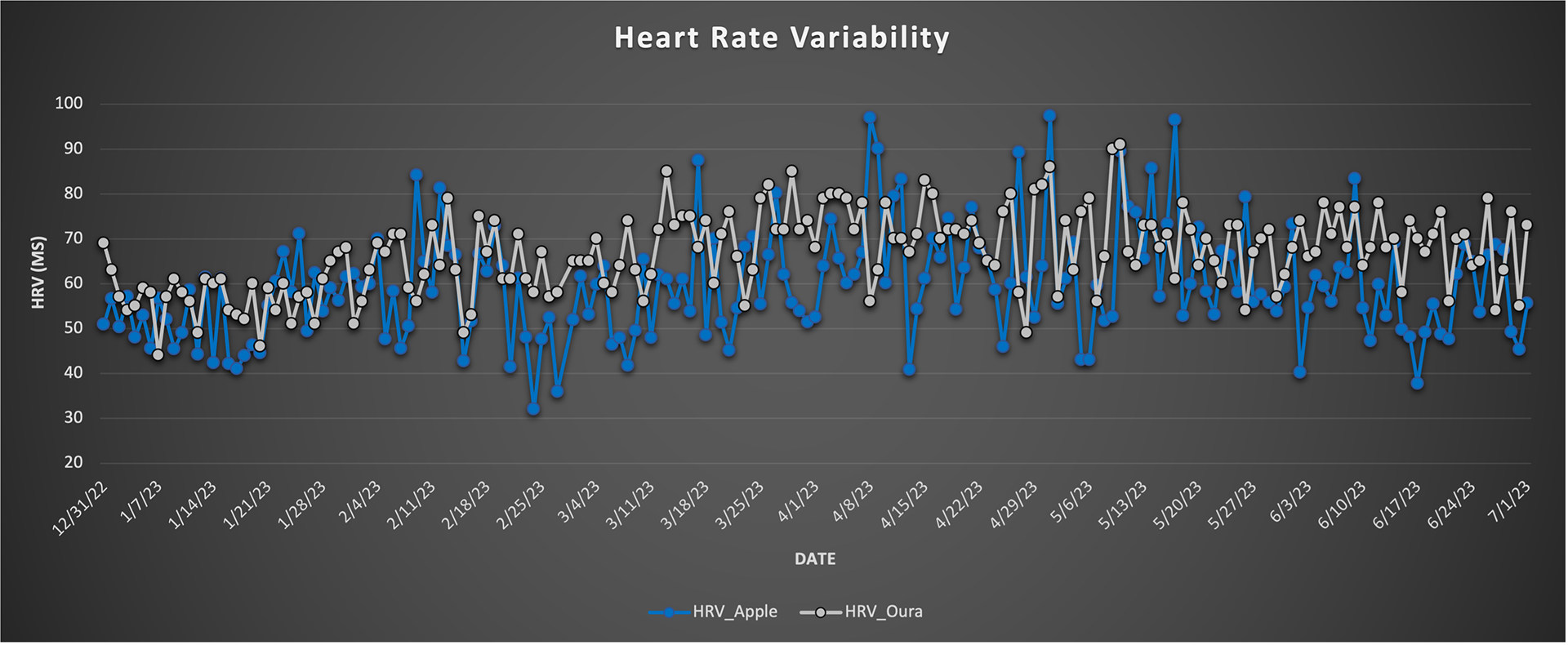
The graph to the left presents heart rate variability (HRV) data given by the Apple watch and the Oura ring while sleeping. While Whoop tracks heart rate variability as well, it was not presented in the sleep data so it was not included in this figure.
Between the two devices, it appears as though they follow a similar trend to one another, despite a couple of major range differences in HRV.
I think that wearing these wearable devices for 24 hours at a time helped measure this metric so they could track my heart rate throughout the day and how it could translate throughout the night, ultimately influencing my HRV.
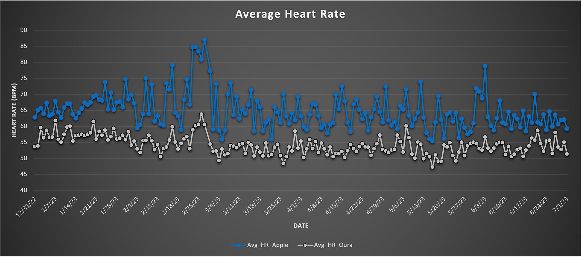
Similar to the graph above, the graph to the right presents average heart rate data given by the Apple watch and the Oura ring while sleeping. While Whoop tracks heart rate in its entirety, it was not presented in the sleep data so it was not included in this figure.
Unlike the trend in heart rate variability as measured above, the average heart rate while sleeping was not as similar between the two devices. While the trends are relative to themselves, they are not in comparison. Again, the Apple Watch seems to think that, in this case, the average heart rate is higher compared to the Oura ring.
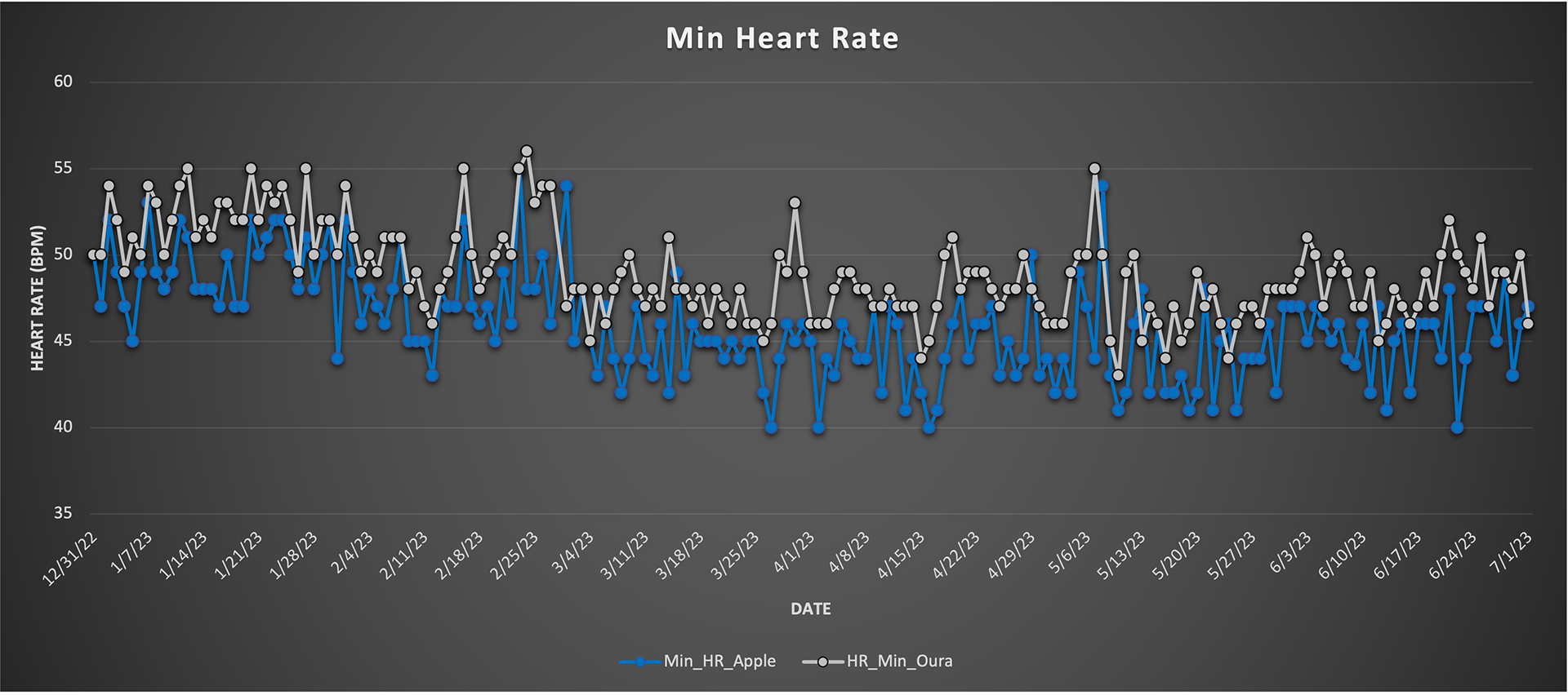
The graph to the left presents the heart rate minimum findings throughout this six-month study. Compared to the average heart rate graph above, the trends in this figure are relatively similar. They follow more of the same pattern and the range is much smaller between the two devices. Overall, it seems like each device gauges minimum heart rate well.
As you can see, each device tracked minimum heart rate while sleeping but neither of them tracked maximum heart rate which is very interesting. Imagine you woke up in the middle of the night, your heart rate spiked well above your average heart rate, and you didn't have any data to show for it. It would be great to know the reasoning behind why these devices don't track max heart rate while sleeping.
Final Thoughts
It is clear that each of these companies and the devices they have created are a huge hit to anyone looking to gain insight into most things happening inside their body. Since I am a wearables enthusiast, I believe that everyone should have at least one device in order to gain insight into their body on a daily basis.
From this study, it appears as though the Apple Watch, compared to the other devices, varies the most in almost every metric when it comes to sleep. Since the Apple Watch may be the most popular, or at least the most well-known, device in this study, this isn't to say that because of its variation, it would not be a good fit. On the contrary, if someone wears their Apple Watch on a regular basis, and is making their lifestyle choices based on the data provided, I think it's a great device for most people. However, if someone wants to gain more than just basic insight into their sleep patterns, perhaps another device would be better for them.
The Amazon Halo is challenging to compare to the other devices considering it burned my wrist. Overall, their platform was simple to use and it was the most affordable wearable device in this study. Unfortunately, (or maybe fortunately), Amazon no longer produces the Halo and this device cannot be used to compare in future studies.
With that said, the Oura ring is the next topic of interest considering that, for the most part, it was the middleman in most of the metrics measured. Its compact design, rise in popularity, and reliable sleep data make it one of the best wearables on the market. For this study, in particular, it produced data in all categories, making it arguably the most in-depth device measured. The Oura ring was definitely the most consistent across the board simply because its trends seemed to be the most similar when comparing the data to itself.
Lastly, when looking at the figures above, the Whoop was high, low, and in the middle, perhaps making it the most well-rounded device measured. Given that this device does not need to be taken off of the wrist to charge, it begs the question of whether or not this is truly the most accurate device. While that may not be the case, Whoop's user interface and the sleep auto-detection that it possesses are challenging to beat. Whoop's data above demonstrates relatively similar trends when compared to itself, and even compared to the other devices.
Overall, I really enjoyed taking a deep dive into my sleep over the course of 6 months. I find it fascinating that each of these devices can have such similarities in addition to vast differences when comparing these metrics. I continue to wear these devices on a regular basis to further my own enthusiasm about these small things that can make such a big difference.
Get a free WHOOP 4.0 and one month free when you join with my link: https://join.whoop.com/A1863B